Power Apps - Progress Bar Example using Timer Control
In Power Apps, you can create a progress bar to visually represent the progress of a task or process. Let’s explore how you can achieve this:
Modern Progress Bar Control:
- The modern progress bar control in Power Apps is versatile and can be used to inform users about their progress as they work within the app. It’s also handy for showing loading scenarios.
- Key properties for this control include:
- Value: A number between 0 and the maximum value (usually representing completion). Applicable only for determinate state.
- Max: The maximum value, indicating task completion. The progress bar is full when the value equals the max.
- Indeterminate: Set the bar to determinate or indeterminate. In the indeterminate state, the value and max properties aren’t honored.
- ProgressColor: For determinate state, you can choose colors like “brand,” “error” (red), “warning” (orange), or “success” (green).
- Thickness: Options include medium and large.
- Shape: Determines the corners of the bar.
- You can use this control to create dynamic progress indicators based on your app’s requirements.
Custom Progress Bars:
- If you need more flexibility, consider building custom progress bars. Here are some approaches:
- Vertical Gallery with Checkbox:
- Initialize a collection with stages and their completion status.
- Insert a vertical gallery connected to the collection. Add a checkbox and a label to show stages and allow user interaction.
- Use the Patch function to update the collection based on checkbox values.
- Modern Progress Bar with Custom Buttons:
- Insert a container and set its width to be responsive.
- Inside the container:
- Add an underlying button (light gray) with no text.
- Overlay another button (green) on top of it. Set its width based on completed stages.
- Display the percentage and “completed” text on the overlay button.
- Horizontal Gallery:
- Insert a horizontal gallery connected to the collection.
- Use it to display stages and their completion status.
- Vertical Gallery with Checkbox:
- These custom solutions allow you to control appearance, responsiveness, and behavior.
- If you need more flexibility, consider building custom progress bars. Here are some approaches:
Here, we will try to learn how to use the Modern control - Progress Bar with the help of Timer control.
Add the Progress Bar control from Insert --> Modern --> Display category.
Add the Timer control from Insert --> Classic --> Input category.
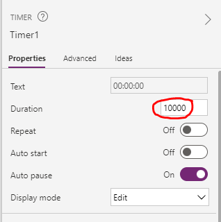
Update the duration of the Timer control property to 10000.
Update the Progress Bar control properties Value, Max with Timer control Value and Duration properties to assign the values dynamically.
We are ready to see the Progress Bar in action. The progress bar increases its value up to the max value.
Click on the play button in Power Apps to see the below magic.


Post a Comment